Project overview
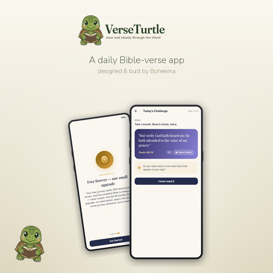
VerseTurtle sends one Bible verse a day — a quiet, unhurried habit rather than another app fighting for attention. Before it landed on the App Store and Google Play, it needed a place on the web to explain itself and point people to the download.
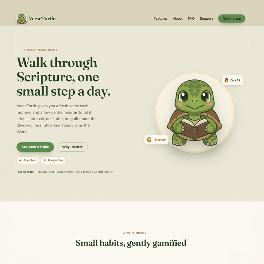
We designed and built that site at verseturtle.com. Because VerseTurtle is also a moibile ios/android app we designed and built ourselves, the site and the product were shaped together — same tone, same aesthetics. You can try the app right here on our site!
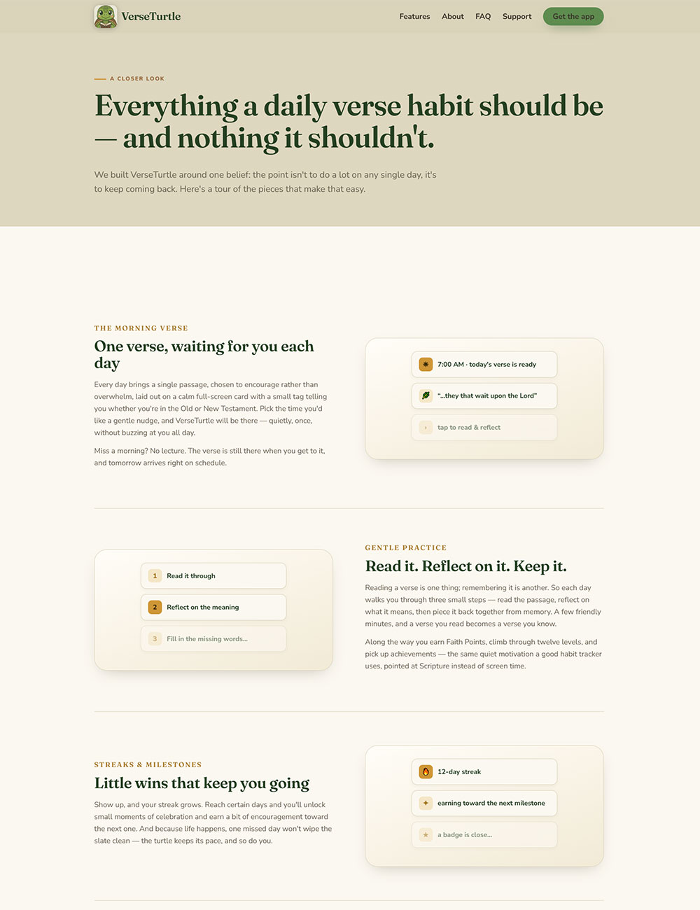
Giving a new app a first impression
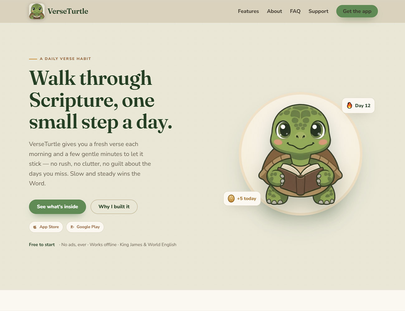
A brand-new app has no reviews, no install count, nothing to vouch for it yet. The website has to do that early work — say what the app is in a line, show it, and make the download the obvious next step. Not a sprawling marketing site; a focused page that carries the same calm the app is built on.
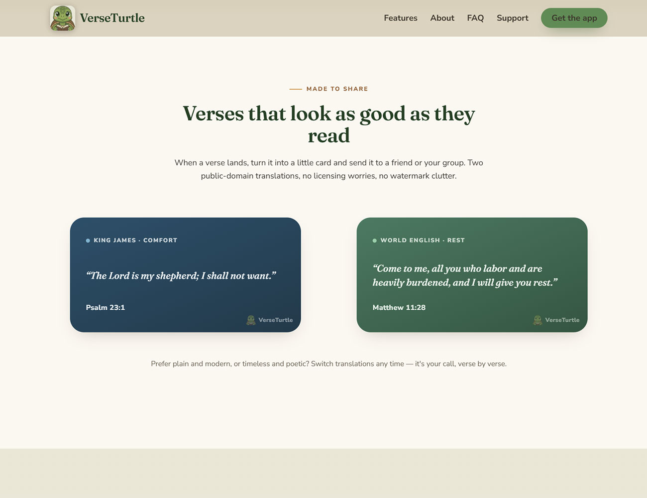
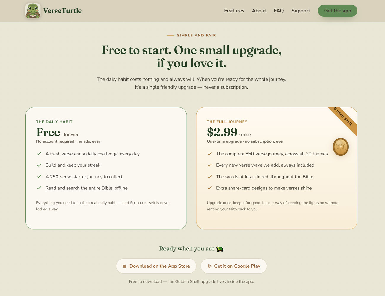
Our Approach
A design that matches the app’s temperament. VerseTurtle is deliberately gentle, so the site is too — room to breathe, soft type, nothing blinking for attention. We kept the route short: what it is, how it feels to use, where to get it. A first-time visitor should understand the app in seconds and never have to dig — on a phone as much as a laptop.
What the site does:

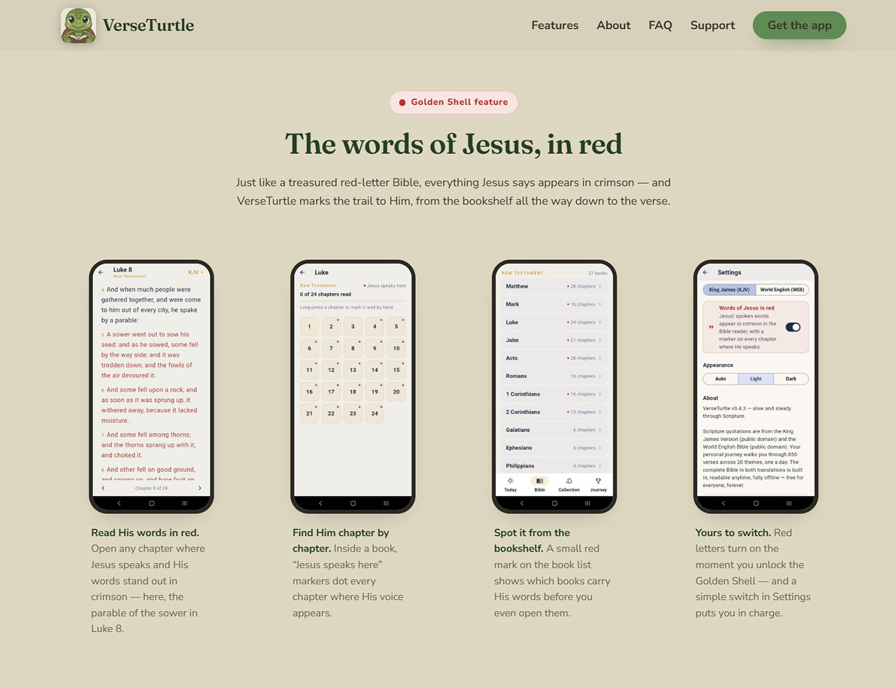
The app behind the site
The site is only half the story. VerseTurtle is also a product we designed and built end to end — see the app case study. And if you’re weighing a site for your own product, here’s how we approach web design.
Services delivered: Website design & UX · Mobile-first responsive build · Conversion-focused landing design · Privacy policy page · Launch